When I first put together my baby boy’s nursery, I used a lot of pieces we already had at home. It was the spring of 2020, the start of the pandemic, and I didn’t want to go out. (Also that was the stage where we were bleaching everything that came into the house… remember that?) Now that he’s two (how did that happen!?), I’m updating his room to be a little more styled. I want it to be a good neutral base that can grow with him as he gets older. Sometime soon, I assume that he will start to put his own stamp on his room. (Until then, I’ll keep in the details that I like – like scalloped lampshades, sailboat prints, and stripes!)
I created two separate mood boards for his room update, both with the current furniture we have. The white dresser (similar option at Pottery Barn), white crib, and beige rocking chair create a blank slate. They’re the perfect base for a neutral nursery. And the room is already painted a neutral white, so I’m starting off with a very white/neutral situation.
You might also like to see my baby girl’s neutral nursery here.
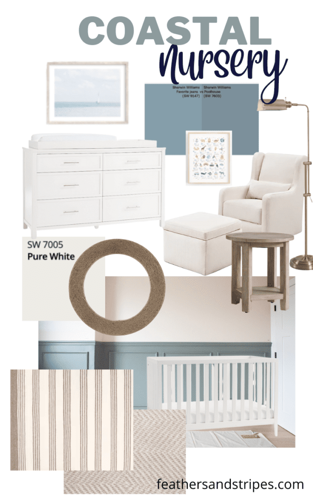
Recently, I added a coastal-style round mirror and side table to bring some texture into the room. Now I’m trying to decide between the two rugs pictured. I’m torn on the rug- which is why you see rugs in both stripes and a chevron/diamond print. I did order a navy and white striped rug, but it feels slightly aggressive when you walk into the room, so I’m returning that. I am toying with the idea of adding a chair rail and picture frame molding, painted a blue or teal, which you can see in the second mood board.
Coastal Neutral Nursery
Moodboard one: Neutral colors with a coastal feel
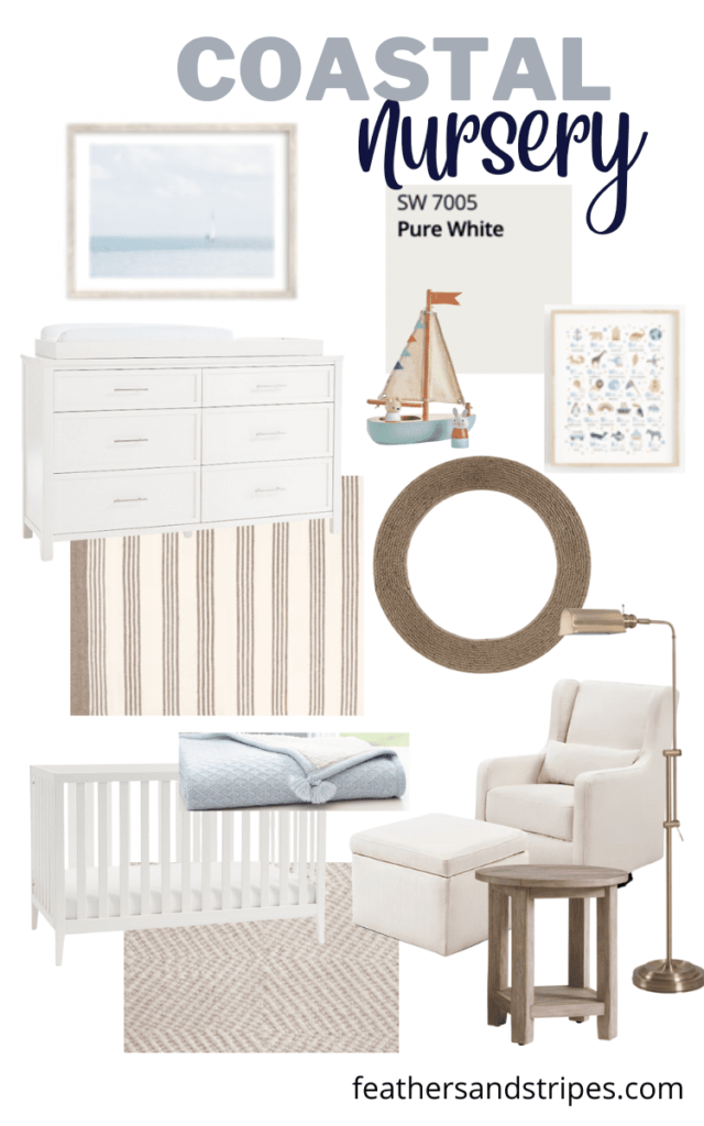
As for art in the room, I’ve loved this sailboat print for a while. (Also love this little toy boat that doubles as room decor!) I ordered the alphabet print from Etsy, and that is already hanging up above his bookshelves. I may move that to a different room though, depending on how much space I have for wall hangings.
The room already has this gold curtain rod, which I liked so much that I put it in my daughter’s room as well.
The second mood board relies on a chair rail and painted walls to bring more color into the room. I love the look of a chair rail with framed molding painted a bold color, like these two Sherwin Williams options. Favorite Jeans is actually a lot more blue in person than the online image. We have our doors downstairs painted that color on the interior. I do love the color, so I wouldn’t be against replicating it upstairs! And I haven’t seen Poolhouse in person, so I will have to get a sample of it to test on the walls.
Moodboard two: Walls are the focal point
I’d love to know which design you like better!




Leave a Reply