I asked on Instagram Stories what you all wanted to see first from our home renovation, and the kitchen was the clear winner. (I won’t lie, I was a little bummed – I wanted to start with the closets! hah!)
Our Kitchen: Before
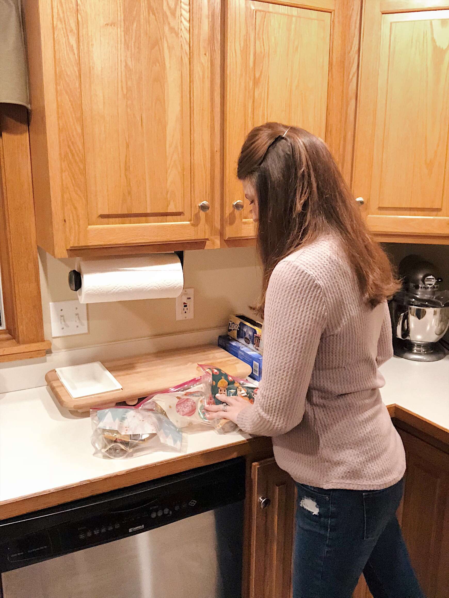
Let’s start with what the kitchen looked like before… it was pretty dark in terms of natural light. We had oak cabinets, tile floor, and a Formica countertop.
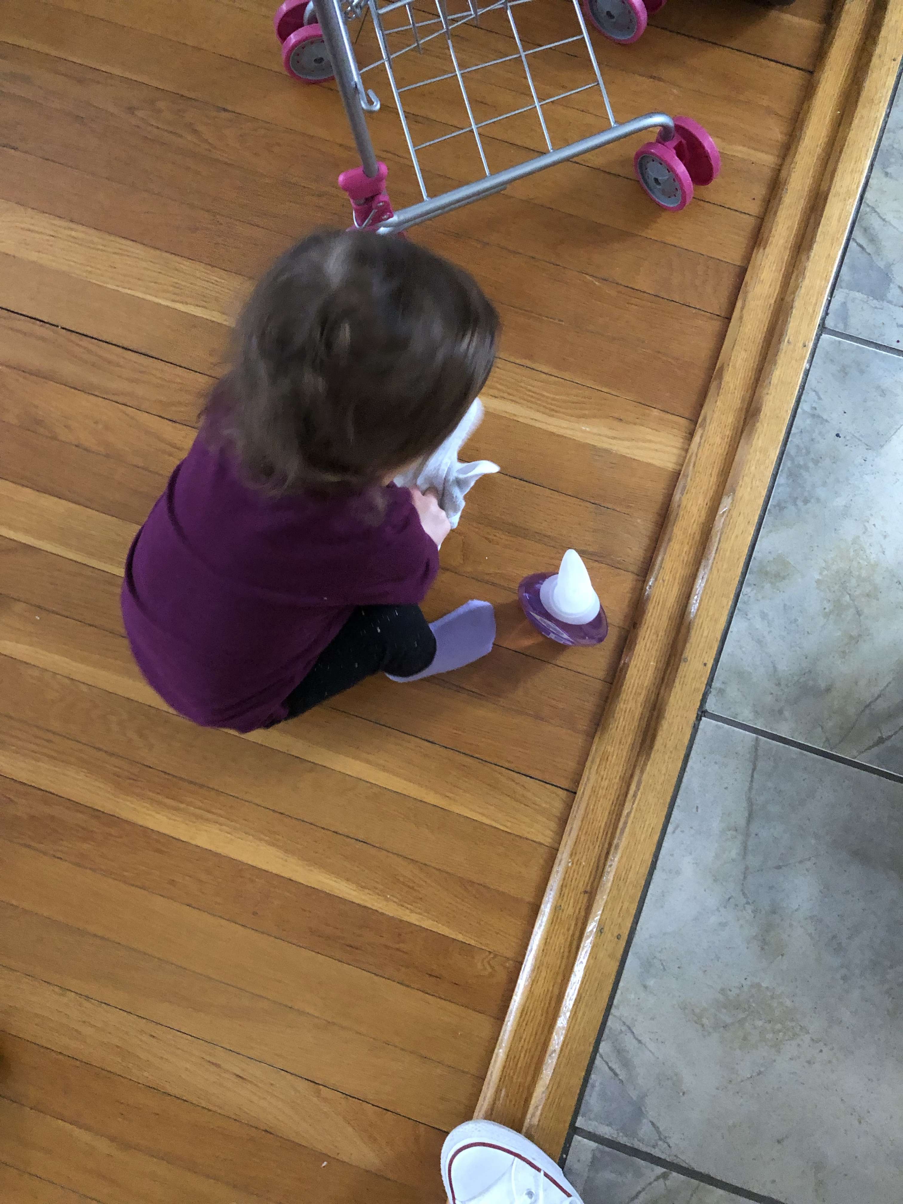
In this picture you can see the slight step down from the tiled kitchen into the hardwood living room. This was the catalyst for the entire project, because everyone who came in our house would trip on this.
We started talking about fixing just that, but that would have entailed doing the entire kitchen floor over to level everything. And the appliances were on top of the tile, so we would be taking the kitchen apart… so might as well replace the kitchen cabinets, and the countertops too.
See how it started to snowball?
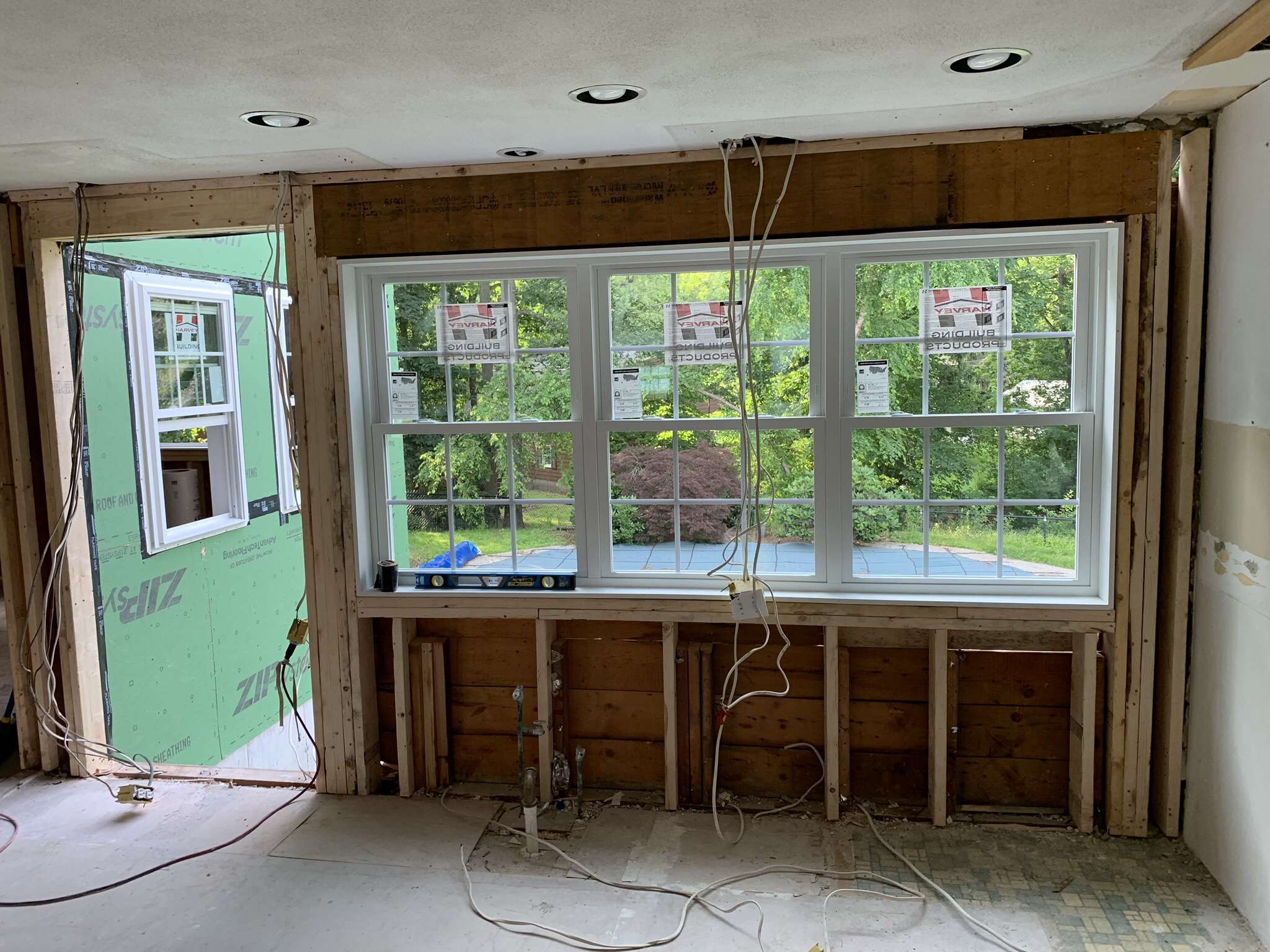
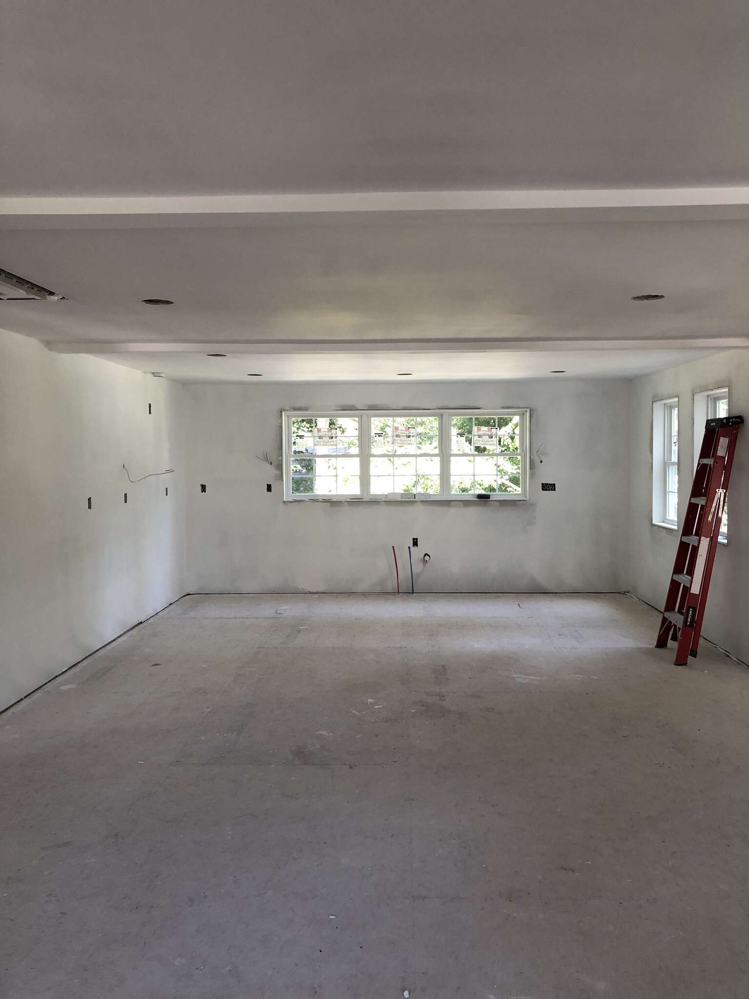
We gutted the kitchen, and transformed the wall of cabinets into a wall of windows. Everyone kept asking if that’s what I really wanted. My two words for the renovation were “bright and functional.” I kept repeating those words over and over!
This is where the old kitchen was: Gutted and now a wall of windows with a door going to the backyard!
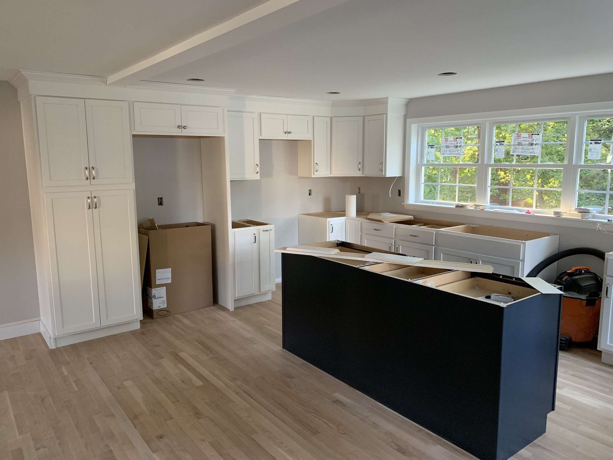
And here is the new kitchen space in the new addition!
The new kitchen is in the new part of the house. (What was the kitchen now functions as a transitional space. Most days it serves as a playroom, but during the holidays we put an extra table there to fit everyone.)
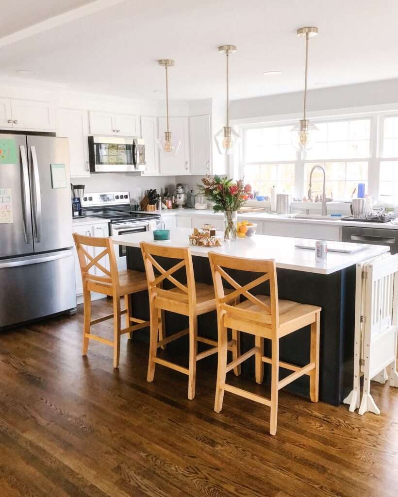
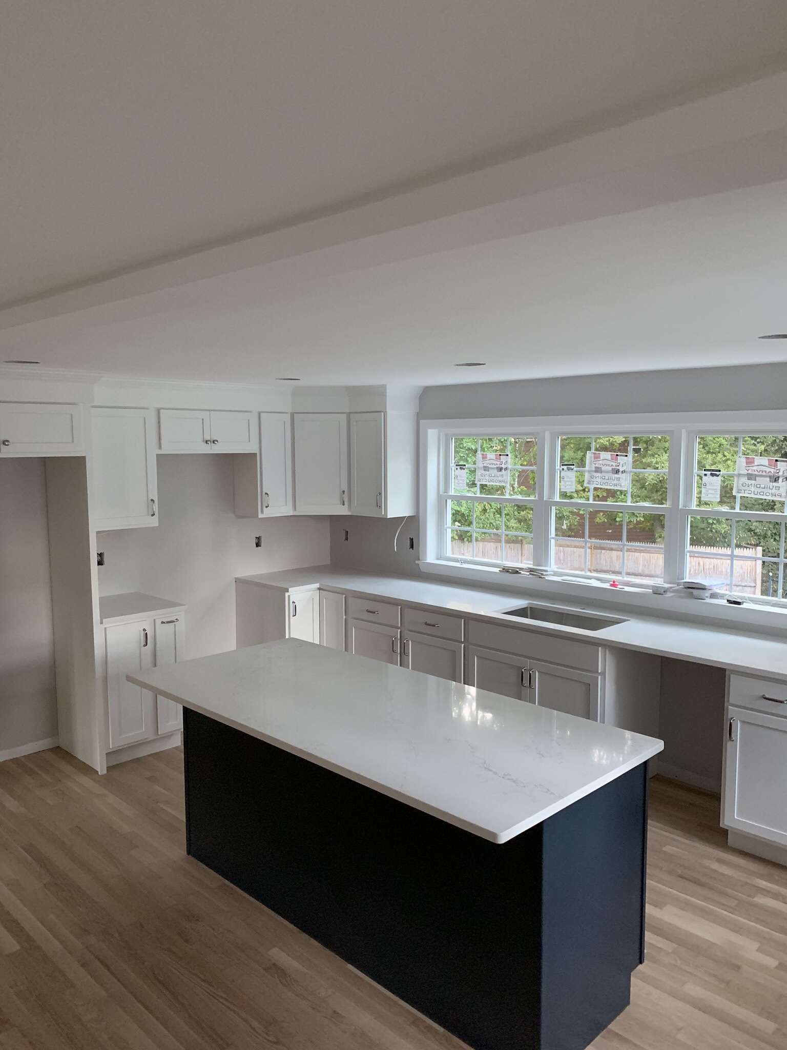
Ultimately, I decided to go with three windows along the sink wall in the new kitchen because I wanted as much natural light as possible. The result is phenomenal: SO much light at pretty much any time of day!
White and Navy Cabinets
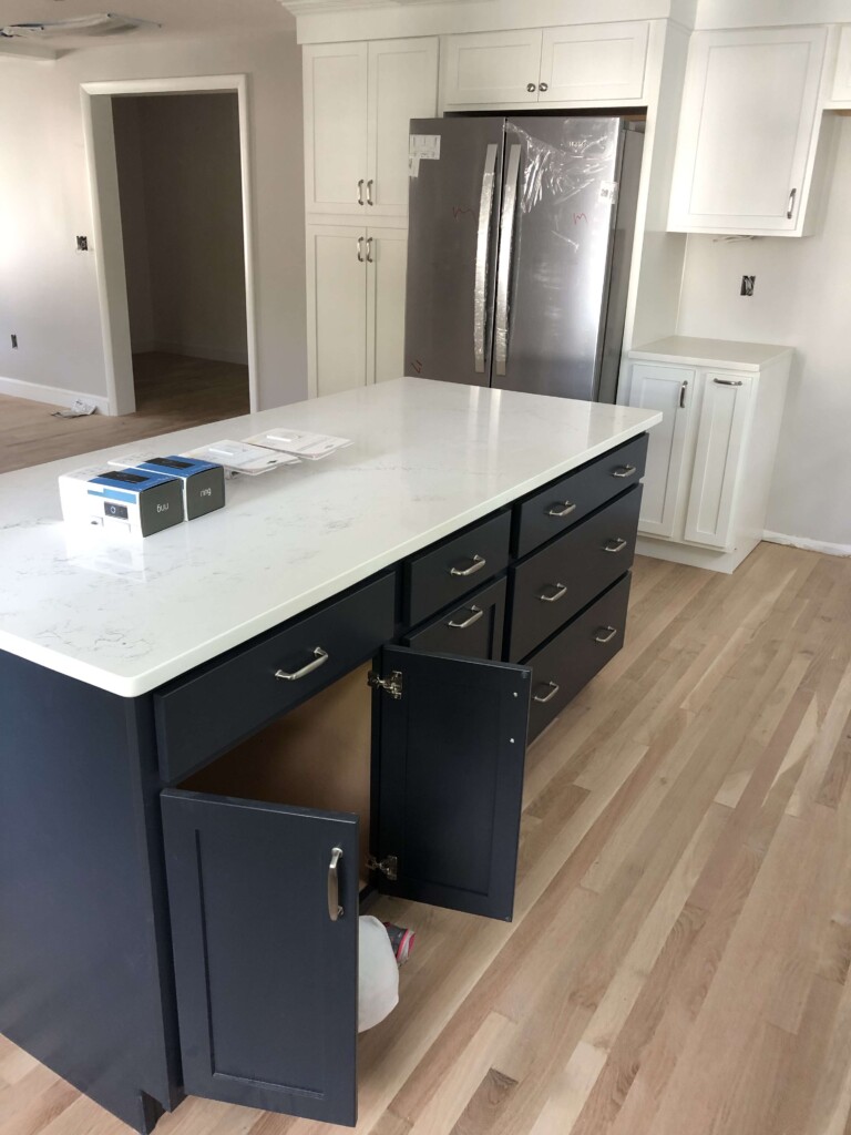
All of the light plus the white shaker style cabinets make for a bright, clean space. I didn’t put too many bells and whistles into our cabinets for a few reasons. For starters, we aren’t sure this is our forever house. But the more I added on little compartments and tucked-away butcher block, I was losing precious cabinet space. We did add a pantry cabinet to the left of the fridge which houses all of our dry goods. Plus we still have the old pantry (a small closet) for storing extra paper towels and other items we don’t use often.
The navy blue island thrills me everyday. When we initially went in to design our kitchen with the cabinet designers, we leaned toward all white everything. I made a comment at some point during that first appointment about navy blue cabinets and the designer said I could do a navy island. I was so excited. I had never seen it before, but a quick Pinterest search showed me plenty of navy and white kitchens. And I loved them all!
The hardest decision in the kitchen by far was the hardware. I was surprised at how much the handles can change the entire look of the kitchen! We opted for a simple handle and a knob that isn’t considered a match but that works well with the handle style. Even this simple handle took us (me) 45 minutes to decide on!
The countertops are quartz. After some research, we decided to go with quartz over granite because of just how low-maintenance it is. I love the look of marble, but it’s just not practical to talk about having to seal a countertop every year. To pick out our countertops, we went to the stone yard and looked at countless slabs before picking one we both liked.
The faucet is another favorite feature in the kitchen. I initially looked at kitchen faucets that cost 2-3x what this one cost, but I didn’t love them for one reason or another. When I found this kitchen faucet, I was sold.
The paint color in our kitchen is Chic Gray.
Kitchen Lighting
We put in a lot of recessed lighting. The old style we had in our kitchen before the renovation was the can-style, but the new style of recessed lighting is covered and looks SO much better.
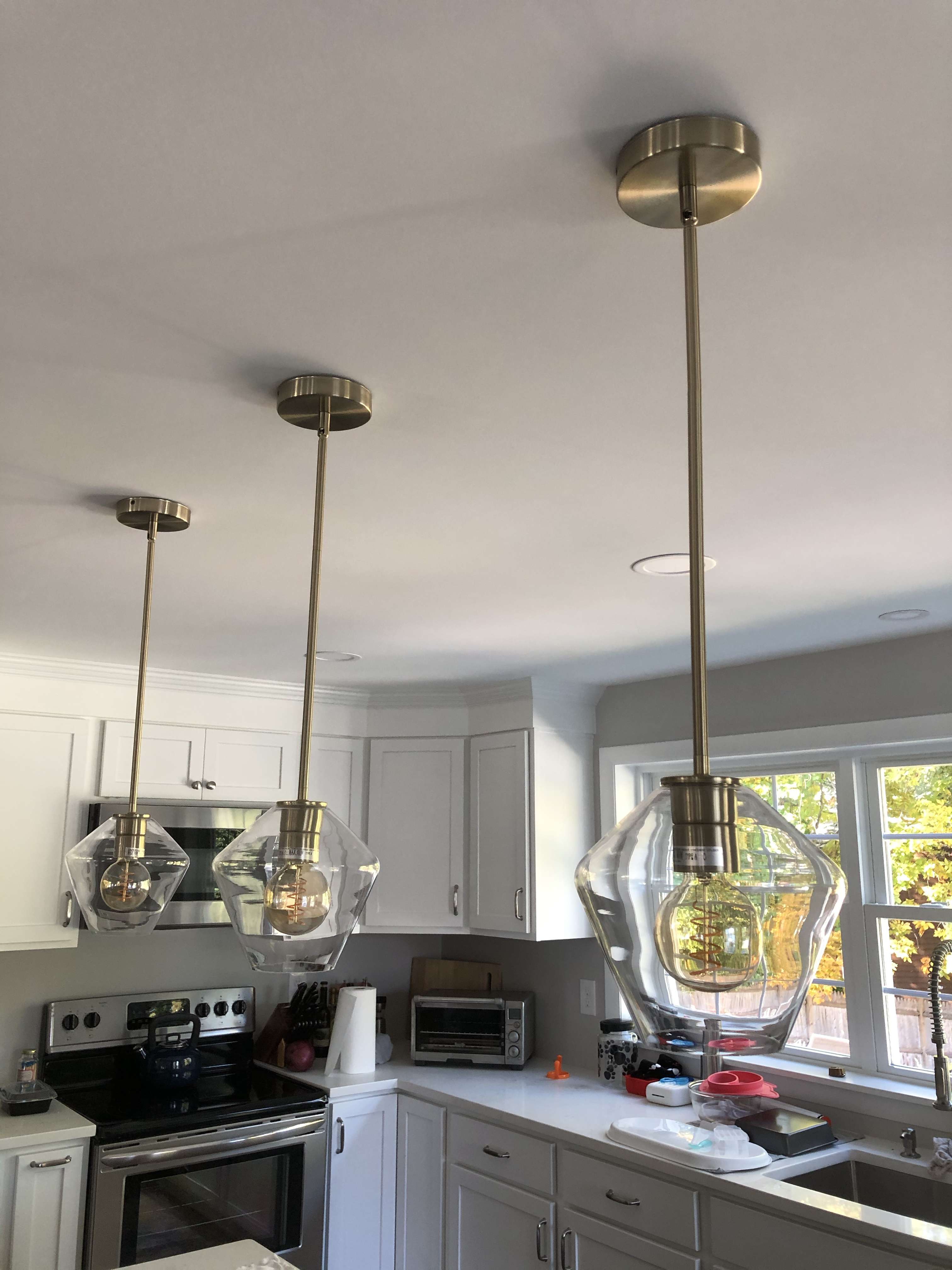
Now let’s talk about the pendant lights. I knew the general style I wanted for the kitchen lights, but I had the hardest time finding that style for sale. I like mixing metals in the kitchen, but I wanted to mix the stainless steel of the sink and cabinet hardware with a champagne color light (not full on brass). I found these pendant lights at one store, and I found the shades at another (the shade is the “Geo” style).
We tried out three different shade styles before deciding on these!
We are still moving things around to figure out the best placement for everything. When we first moved back in, the coffee station was all the way to the right. Now it sits on the left, between the fridge and stove.
But since moving back into the house, we have hosted 3 or 4 big group dinners, and it has been magical to have a LOT more space!
Our Kitchen: After
Shop our kitchen:
More updates to come, I’m sure!


This transformation is stunning!